06 October 2020
In my childhood, I discovered vector drawing with Flash and it was a blast. The tool was very simple to use and intuitive for drawing. Most of my early work was reproducing exisiting drawings from my favourite cartoons. God only know how many Simpsons wallpapers I made from VHS screenshots. This made me a master of the drawing tools.
However, I knew the pros were using Illustrator to do vector drawing. So I started it, and it was tough. The tool was way less intuitive than Flash but incredibly powerful. It took me years to master the art of this software, but it’s now my third hand. There’s powerful feeling to know you can build anything you want with a tool you master.
Since then, a lot has changed. I turned into a software engineer with a love for Open Source. Adobe moved to subscription system and their software kept getting heavier for no reason. It was a normal way for me to try Inkscape.
My first attempt was 8 years ago on Ubuntu. It was short, the UI was impossible to me and my Illustrator habits dies hard.
Then few years ago on a Mac, X11 was required to run it on Mac OS. It wasn’t a good start. The whole session didn’t last very long either. The UI lacked so much of attention that I didn’t bother to really give a try. This was a terrible mistake.
But recently, the 1.0 was released, and reached the top of HackerNews. X11 was officially dropped. It was time to give another go.
The UI didn’t change much since my last attempts. However, after few searches, I realised that the UI can be customised themed, enough to give a dark theme look. So I forced myself to discover the tool, forget my habits of Illustrator and try it. Guess what! IT WAS FUN!
Ok, I had to Google how to do stupid things like rotating the selected element. The convention is get close to a corner of the selection, to see the cursor change to a curved arrow then rotate your element. Nope, you must click on the selection to toggle between rotate and scale mode.
Same with the common shortcuts: shift to resize with ratio, alt to clone a selection. These two are the base, they are a convention and they are implemented everywhere, not only Adobe software. Well the behavior in InkScape is different. The documentation provide a list of shortcuts and they are customisable. It might worth it to spend some time to build my own config file.
However the most difficult was the absence of layer details. You can create a layer, add elements in it, but there’s no way to see the list of what’s in your layer. This is super important to see all the different items it contains and reorder them, or even name them. Imagine having a crontab where you can only add tasks but not see its content. This is bananas.
Despite switching to a dark theme, the UI is not customisable. It feels overwhelmed by the amount of toolbars and buttons. The sense of padding and margin between tools lacks of attention. It’s even scary at times.
I bet you feel this review is pretty savage, but it’s not. Inkscape is a pretty good tool! Of course Illustrator is a different category. They have a budget and massive teams and they started in 1987.
Inkscape export tools are beyond crazy! The palette of effects is absolutely fantastic, and I love losing myself in the exploration.
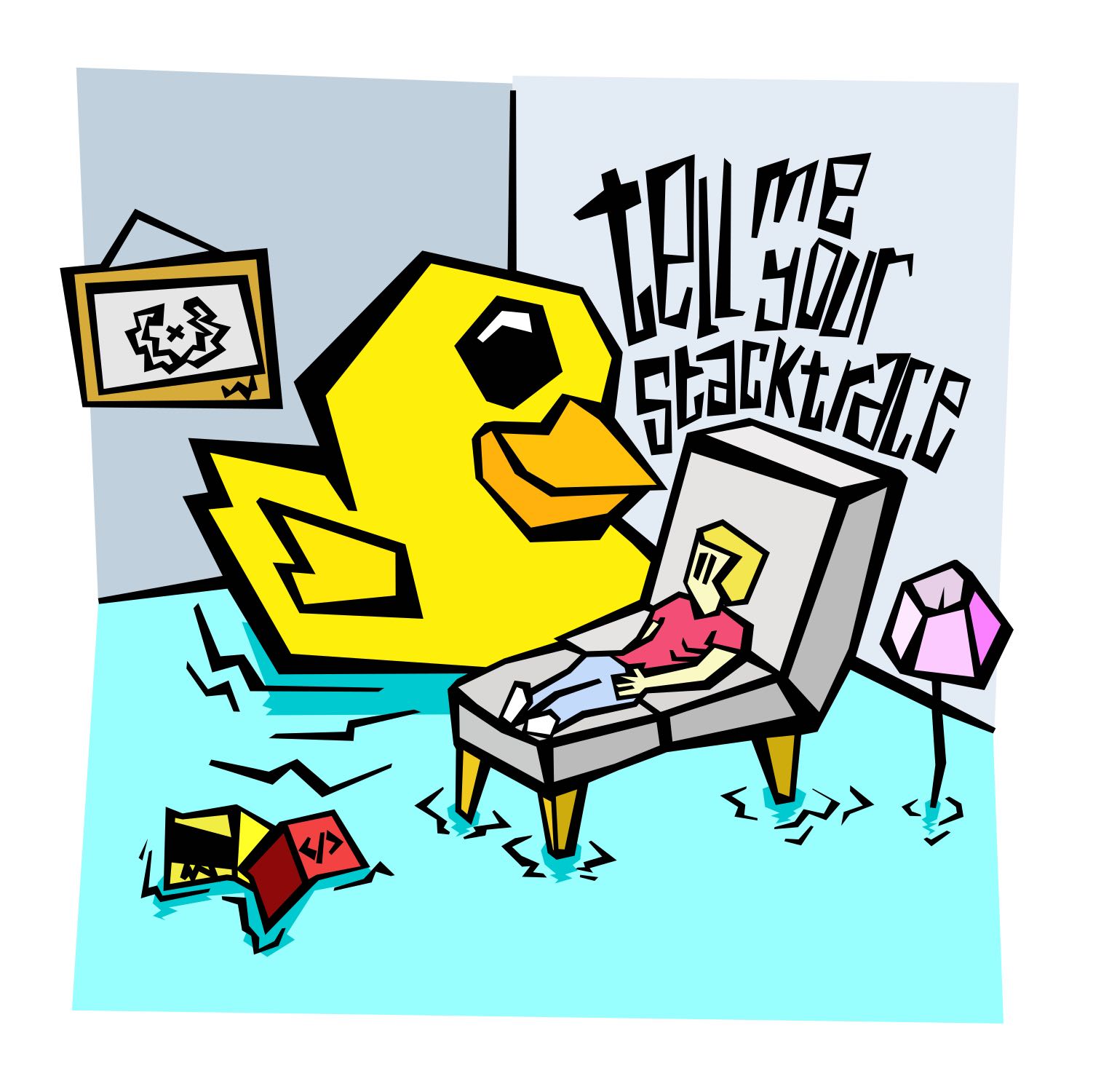
As a test, I did a simple illustration and forced to admit it was very easy. It just a set of habits to change, but the technique stays the same.

Debbuging therapy
I hope Inkscape will continue improving. My dream would be for them to follow what Blender did many years ago and release a brand new UI, but it’s not in my power and the maintainers knows what’s best to focus on. Also, destroying years of user habits with new shortcuts is the stupidest thing to do. I did a donation to the project and will do at every next interesting feature they will release. That’s what’s exciting, there’s a long road ahead, and they need more support to push them forward.
I have faith in them, they will rock, because they already do.