It's like the gravel pattern in Japanese gardens but with pixels.
15 February 2021
Over the course of a two evenings, an idea crossed my mind and had to be built. A mobile pixel editor to doodle and relax. The only originality about it are it’s constraint: black and white only, 21 by 21, and an uneditable pattern of pixel. I introduce to you : Graxel.
The UI is very minimalist: the canvas and 3 actions.
The ‘canvas’ is a SVG, very similar to triangulart. Using SVG makes it easier to edit and get input events from the user. In order to make the editor looks perfect, it scales to the closest ratio where the pixels are a rounded number (not a float). Otherwise some black lines would appear between pixels.
The actions are very basic too:
reset: clears the canvasrandom: fills the canvas randomlyshare: opens share UI
However let’s have a closer look to the last two actions.
First, the random action. In the original version, it was filling the canvas with random values. It wasn’t groundbreaking. So before releasing the project, this feature needed some work. I wanted to generate something pleasant at every hit. The idea was to fill only a 1/8 of the canvas with random values and repeat it by symmetry to the entire surface. This changes everything. It looks beautiful at every attempts. But why?
From my experience, I think I can explain why on two points:
- The symmetry. It’s one of the basic principles to make something beautiful. In this case the symmetry is on 4 axis, probably the maximum reachable with the canvas constraints.
- The principles of doodling. I love doodling on my free time, it’s something relaxing and satisfying. From an external point of view it looks difficult but it’s the easier form of drawing. Due to the amount of details, you can easily make a mistake, nobody will notice. The secret of doodling resides in the content density. The drawing can be abstract, poor taste or badly drawn, but as long as the space is evenly balanced, the doodling will look good. This is exactly what’s happening in this editor. Due to the base pattern, the canvas can be filled at 25% of the space when empty, or 75% when full. Providing an average ratio of 50% with an evenly balanced density. This is perfect.

Empty > Fill 1/8 randomly > Clone on all axis
Last, the share feature. Social media integrations have always been a no go for me. It makes the webpage heavier, poor design, user tracking, and not designed for all sharing possibilities. However, a fairly recent API changed everything: it’s the Share API. It fixes all the previously listed problems: no scripts to add, repect user data, design it the way your want, let you share on what the user uses. Sadly, it’s mostly mobile, but it will come to desktop very soon. Providing the ability to share a URL with message directly from a JavaScript call is fantastic. Even better, on some browser (Chrome mobile only, obviously) you can share files. So when the share button is tapped on Chrome Android, the canvas is shared as picture so users can post their canvas directly on social medias or share it on messaging apps. The future is bright.
Also, the canavas data is stored in the URL hash, making it easy to share without the Share API.
Feel free to have a try at graxel. As usual the source code is available on GitHub.
Last note, if you poke the random button too much, it might come alive.
‘‘For the first time, I managed to transform randomness into beauty, at every attempts.’’
permalink
01 January 2021
Last weekend was the perfect time to hack something that bugs me for a while. At home, one of my RaspberryPI is serving all my media via an Apache server. It’s simple and reliable. The main use is to stream content to the Chromecast. The workflow isn’t amazing but suits me:
- Fire up Chrome on my phone
- Browse my server
- Open the
.mp4
- Tap the Cast button on the video player
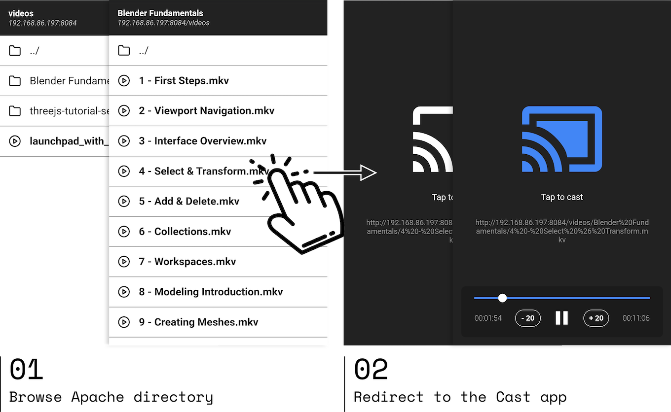
So far it’s ok, but it gets tricky when it comes to stream an .mkv file because this format isn’t natively supported by Google Chrome. Opening it will start the download instead of showing the video player. In this case, the workflow is to:
After writing it down, it doesn’t sound like a big hassle, but damn it’s annoying. Especially if you plan to watch a ton of short videos.
The solution in mind: hack the template engine of Apache that generates the HTML indexes to inject the Cast script.

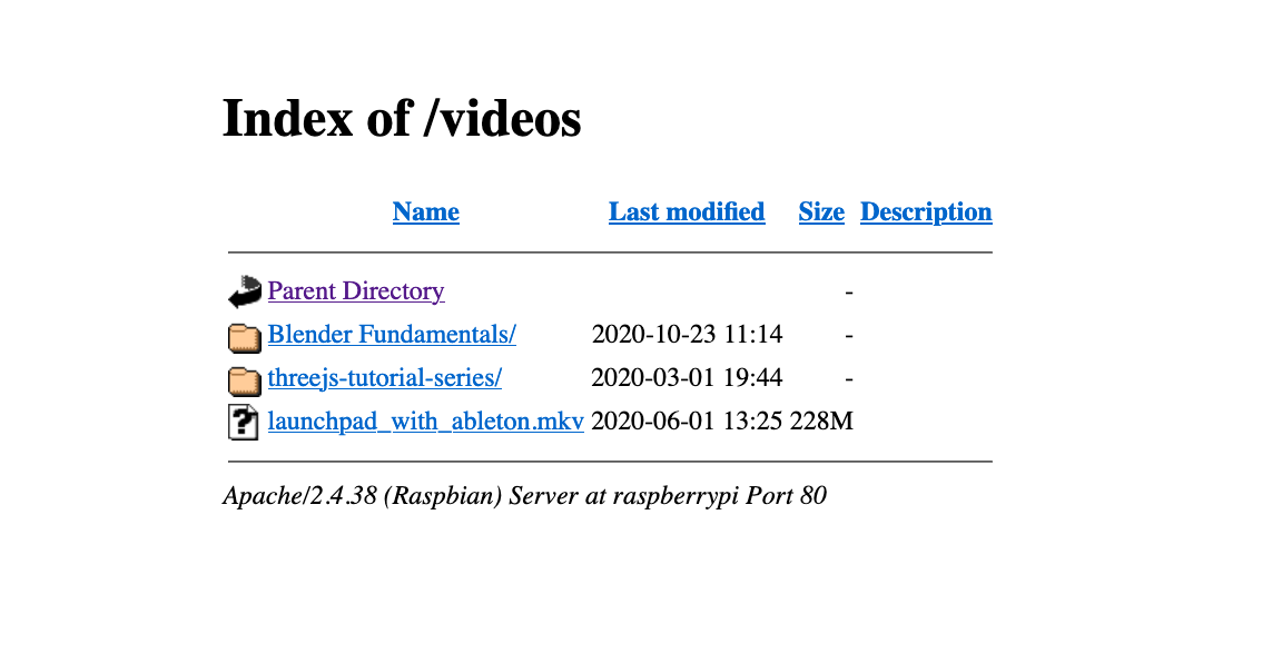
Apache indexes: look at this beauty
Sounds fairly simple and easy, but after some research it isn’t. The only customisation that Apache allows is adding a style file. Back to square one.
What about a single page app! Let’s imagine, place a HTML file somewhere on your Apache folder. By being served from the same domain, it can make requests to other folders and parse the index.html then recreate the directory navigation. It sounds ideal: a simple html file which does all the magic, and can be placed on any server without touching the Apache config.
Along the way, everything seemed fine. The parsing was simple to do, the style was under my control and the list of files was filtered to show video files only.
Then comes the Chromecast integration. Back in the days (2015, the early days of the Chromecast) my pet projects consisted of adding the Chromecast functionality to my favourite french TV channels, by a simple script injection. So it felt like the Cast part would be a piece of cake. Well…
In the meantime the Cast API has changed. It’s still retro compatible but the place is no longer familiar to my memories. My anger reached the sky when the basic tutorial from the docs wasn’t working on my environment. Alas, my old code from back in the days wasn’t working either. It was clunky, sometimes it was working, sometimes it did not. It’s only after reading the docs again that my attention stopped on:
Warning: Chrome sender apps need to support HTTPS to maintain Cast compatibility, as Chrome is deprecating support for the Presentation API on insecure origins.
Obviously my Apache server isn’t running on HTTPS. My first thought was to abandon here, sadly I’m stubborn as f***. Here are the other directions I tried to run into:
-
Running my Apache server on HTTPS without certs?
NO, the Cast API boots but never streams. It might consider that the domain is not secure enough.
-
Use Let’s encrypt to generate a cert and use it on my server?
NO, forget about it, I’m too lazy for that bullshit. It’s a RaspberryPI on my local network, not a production platform. Plus I would have to go through all of this mess again if I reset my PI.
-
Let my Apache server accept CORS requests so the SPA can request it while being hosted on HTTPS?
NO, it’s not allowed to do requests to a HTTP server from HTTPS. Frustrating, but makes completely sense, duh!
-
Using an iframe, stored on a valid secure domain, to send the URL to stream via message?
NO, the Cast won’t start without a genuine user click.
-
Same but with an icon, integrated on the main UI so the user can click on and start the stream?
NO, the Cast won’t start because the parent window isn’t ‘secure’. I reached that conclusion after embedding a YouTube video on a HTTP domain: the Cast option isn’t displayed.
-
Single page app hosted on HTTP to browse the server, with video link opening a new tab to a page ready to cast your media?
Yes, finally yes. If you think about it, it’s just streamlining the original workflow. It’s pretty simple and actually the cast part can be reused by anyone.

If you want to stream a URL to a Chromecast without hassle: fire a new tab to https://maxwellito.github.io/apachecast/cast.html#[URL_TO_CAST]. There’s just one big button. Once the receiver is selected, the stream starts.
The Apachecast source code is available on GitHub.
So what lessons to get from this:
-
Remember that Chrome considers localhost differently than other domains while on HTTP. It lets you use HTTPS reserved features (like Cast API and PWA) even if it doesn’t meet the security requirements. Which might make you feel that everything works, until you test in real conditions.
-
The API could be more helpful and provide the real reasons why things don’t work, and not just No cast extension found (especially since no extension is longer required). There are so many failing reasons but without information it felt like debugging a web page on IE6.
-
Next time I will install Plex and shut the fuck up.
permalink
06 October 2020
In my childhood, I discovered vector drawing with Flash and it was a blast. The tool was very simple to use and intuitive for drawing. Most of my early work was reproducing exisiting drawings from my favourite cartoons. God only know how many Simpsons wallpapers I made from VHS screenshots. This made me a master of the drawing tools.
However, I knew the pros were using Illustrator to do vector drawing. So I started it, and it was tough. The tool was way less intuitive than Flash but incredibly powerful. It took me years to master the art of this software, but it’s now my third hand. There’s powerful feeling to know you can build anything you want with a tool you master.
Since then, a lot has changed. I turned into a software engineer with a love for Open Source. Adobe moved to subscription system and their software kept getting heavier for no reason. It was a normal way for me to try Inkscape.
My first attempt was 8 years ago on Ubuntu. It was short, the UI was impossible to me and my Illustrator habits dies hard.
Then few years ago on a Mac, X11 was required to run it on Mac OS. It wasn’t a good start. The whole session didn’t last very long either. The UI lacked so much of attention that I didn’t bother to really give a try. This was a terrible mistake.
But recently, the 1.0 was released, and reached the top of HackerNews. X11 was officially dropped. It was time to give another go.
The UI didn’t change much since my last attempts. However, after few searches, I realised that the UI can be customised themed, enough to give a dark theme look. So I forced myself to discover the tool, forget my habits of Illustrator and try it. Guess what! IT WAS FUN!
Ok, I had to Google how to do stupid things like rotating the selected element. The convention is get close to a corner of the selection, to see the cursor change to a curved arrow then rotate your element. Nope, you must click on the selection to toggle between rotate and scale mode.
Same with the common shortcuts: shift to resize with ratio, alt to clone a selection. These two are the base, they are a convention and they are implemented everywhere, not only Adobe software. Well the behavior in InkScape is different. The documentation provide a list of shortcuts and they are customisable. It might worth it to spend some time to build my own config file.
However the most difficult was the absence of layer details. You can create a layer, add elements in it, but there’s no way to see the list of what’s in your layer. This is super important to see all the different items it contains and reorder them, or even name them. Imagine having a crontab where you can only add tasks but not see its content. This is bananas.
Despite switching to a dark theme, the UI is not customisable. It feels overwhelmed by the amount of toolbars and buttons. The sense of padding and margin between tools lacks of attention. It’s even scary at times.
I bet you feel this review is pretty savage, but it’s not. Inkscape is a pretty good tool! Of course Illustrator is a different category. They have a budget and massive teams and they started in 1987.
Inkscape export tools are beyond crazy! The palette of effects is absolutely fantastic, and I love losing myself in the exploration.
As a test, I did a simple illustration and forced to admit it was very easy. It just a set of habits to change, but the technique stays the same.

Debbuging therapy
I hope Inkscape will continue improving. My dream would be for them to follow what Blender did many years ago and release a brand new UI, but it’s not in my power and the maintainers knows what’s best to focus on. Also, destroying years of user habits with new shortcuts is the stupidest thing to do. I did a donation to the project and will do at every next interesting feature they will release. That’s what’s exciting, there’s a long road ahead, and they need more support to push them forward.
I have faith in them, they will rock, because they already do.
permalink
22 September 2020
I passed the Life in the UK test. But my journey to it was way more interesting than it seems.
This test is one of the requirements for UK citizenship application. The test consists in 24 questions about UK history and modern life. The pass mark is at 18, so 75% right answers to pass. There’s an official book to practice, made by the Home Office, where all the questions are made from.
History class has never been my cup of tea. As far as I remember I never enjoyed studying history. So learning the one of the United Kingdom of Great Britain and Northern Ireland (yes, this is the official name) would be slightly tough.
Knowing some friends who previously passed the test, I asked for their advice. All of them were pretty clear: crunch practice tests until you never fail. There are tons of apps/websites with question sets to practice. However, I wasn’t very keen to install random apps on my phone and jump between them to not miss a single question. So I took the problem in a different way.
My plan:
- Looking at the most popular practice apps
- Download their APK
- Decompile them (sounds more badass than ‘unzip’)
- Look for the questions source
- Reformat them all for my own app
- Deal with guilt
It was a very fun night, seriously.
Parsing data from one format to another is actually amusing, because every app is using different format: CSV, SQLite, JSON, TXT. Then with a simple Node script, the raw data can be transformed to the format of your choice. Then you own a little base of 7000 questions. Sounds great, but it’s not, because most of it are doublons. After implementing a very cheap way of detecting them, the output shrinked drastically, as you can see with the output above.
$ node main.js --stats
Base size: 3041
Tip count: 2939
Doubles: 4023
Same answers: 339
Most the these apps are simply reusing the same set of questions. For those who don’t, they rephrase the questions. I bet all the original questions are from practice books, then been copied to apps, then rephrased (probably by fear of lawsuit) for copycats. Sadly my dataset is not as clean I would like, but it’s good enough to play with.
After building a very basic PWA, and many UI tweaks, here is Life in the UK with the source code. This is very minimalist, no framework/build, the whole logic (HTML+CSS+JS) is in the index.html (~340 lines). Thanks to the PWA, it works offline. Also it keep track of the failed questions to make you practice them later.
Feel free to hack it, copy the questions for your own use, make PR to improve the app, help sanitising the dataset… or just test it and see how knowledgable you are about Life in the UK.
PS: I think I’m ready for my first DMCA takedown, but I don’t care I passed my test ¯\_(ツ)_/¯
permalink
13 April 2020
Over the last decade, many technology practices or social behaviour became the norm or even the standard. Here are the main ones I have in mind, and I guess I’m missing plenty.
Devices that can become completely obsolete when the parent company cut the attached service. From smart speakers to indoor bikes. When the attached service dies, the device loses most of its functionality or become a complete brick. The most shocking for are high-end smart speakers that can’t be used by physical jack or Bluetooth, making them pointless when the parent company decides to no longer support it.
Camera bumps on phones. It’s just a detail, but phones are no longer flat. I’m probably the only one who bothers about it.
Death of the 3.5 jack on mobile devices. It’s debated many times. I don’t want to dig into details. It’s just no longer there. But still available with a dongle.
Dongles. It’s not something very new, but its use ramps up over the last decade, mostly in the Apple ecosystem.
Selfies. During the early days of the internet, the action of taking a picture of yourself was an act of narcissism. Today it’s a natural thing, completely mainstream and socially accepted.
The short lifespan of smartphones. The normalisation of 2 years lifespan on 1000$ smartphones is quite alarming. Things are getting better. Apple got busted downclocking older devices, making 2 years old devices a hell to use.
1Mb+ web pages. It breaks my heart as a frontend developer, but it’s becoming the norm. Single Page Apps are the default for websites when most of it doesn’t need it. The same thing applies to apps on mobile. A simple and performant website could replace many.
Devices repairability falling over. Before 2010, I don’t think it was acceptable to have a battery glued in laptop. Now it is. Laptops with RAM and storage soldered to the motherboard, Torx screws, rivets… and more. Buy it, use it, break it, change it.
Apple influence. From the previous points, we can understand that when Apple decides to do something bold, it’s a signal to the rest of the industry to align on it. Removing the jack, done. Camera bump, done. Notch, done. The primary influence the Android manufacturers had on Apple was the big size screen.
Tracking and over exposition to advertising. Most of the population still don’t understand how this permanent tracking works. Visiting a shoe website from your mobile then see advertising from Amazon to sell this product is now typical. There is no way of using technologies and services guaranteeing complete privacy.
Personal information used for micro targetting on polical campaingns. The Cambridge Analytica scandal from 2018 revealed to the world how personal information and targetted advertising could be a powerful weapon. Sadly, like the previous point, no shocking example enlighted the public to understand the danger of this practice.
High difficulty to keep a social life away from the giants (GAFA). Back in the days, ways of communication/broadcast were state-owned like mail, landlines (voice and SMS) and television. Nowadays, the internet is the lowest layer, but everything is in private company products. Making abstraction of all the services provided by the GAFA is possible, but tough. One classic example is people creating Facebook events and forget about people who aren’t on the social network.
The subscription. From music to video streaming, to software, and online storage. It seems to become the baseline for new business models. It can be a good thing like a bad thing. But for significant software, like Adobe, it’s like leasing, but you never end up owning the product.
This post is not a positive summary of the last decade, its intentional, a sad look back and not a good feeling about the future. The reason is I wrote this post on a second hand MacBook Pro 13 from 2012. It’s just fantastic to be able to open it without specific tools, accessing the storage, RAM and battery. It is a sweet freedom to can upgrade your computer along the time. Let say paying a computer at higher prices for a black box, is not the future I wanted.
permalink
older »


