How to satisfy your Justice addiction
05 June 2012
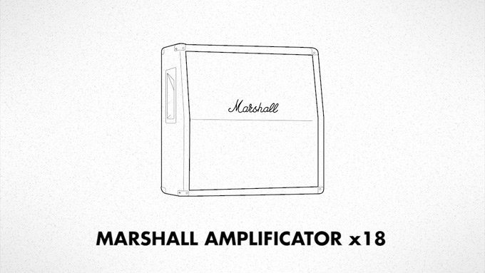
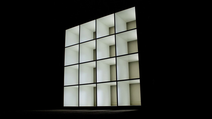
One of my best accidental success. Let's begin from the start, we are on the start of 2012 and I had the chance to see one of my favourite electronic band : Justice. The live show is very impressive, with a big light show. To explain, their stage is made with two little walls of 3x3 fake Marshall amplificators (full of LED for animations). Behind the stage a massive curtain of lights, stobe lights, and other lights.
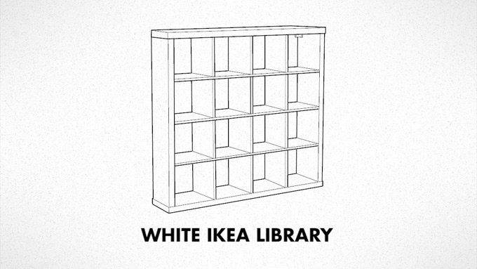
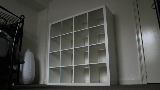
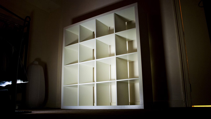
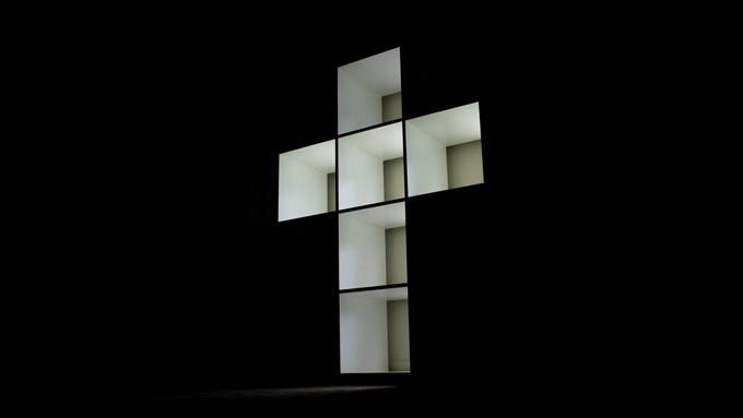
After having moved to London, I had to buy some furnitures, whose a white IKEA library. Many week later I made the link between both, recreate the Justice live show with my library. But how ? I have no skill in electronic (even if I begin to take a look to Arduino). So I found the idea of stop-motion very interesting and easy to manipulate once on my computer. For the audio I used a live-rip found on soundcloud.
For the first time, the social network Behance put my project on featured on their Motion Graphics page. It's nothing, but very surprising and pleasant.


‘‘May content subliminal pictures for IKEA’’
permalink
A world split in two parts
17 October 2011
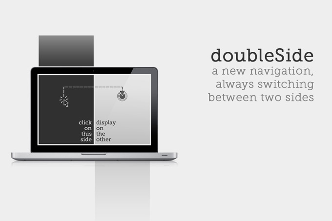
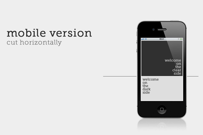
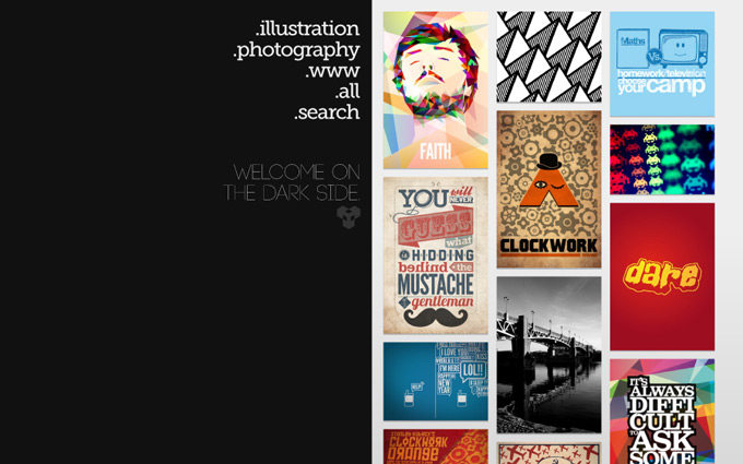
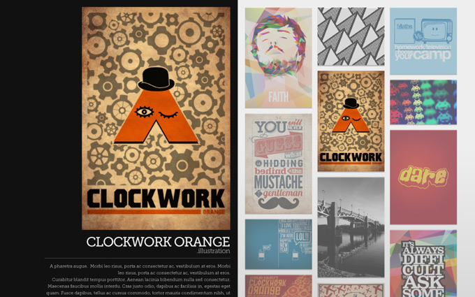
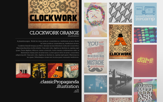
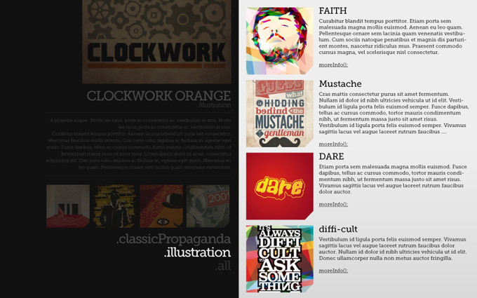
Double side is a website concept divided in two parts: dark and bright side. Everytime you click on an item the result appear's on the other side. The concept is ready for responsive design, this time the page would be cut vertically.
It can be realisable in HTML5/CSS3 (with media queries) and the help of jQuery.

The main idea, a webpage, two sides.

The mobile version, you switch between up and down.

.index

.project

.project

.category
‘‘Make a website mockup is cool, to code it is less.’’
permalink
07 October 2011
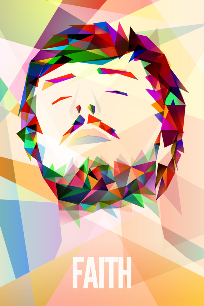
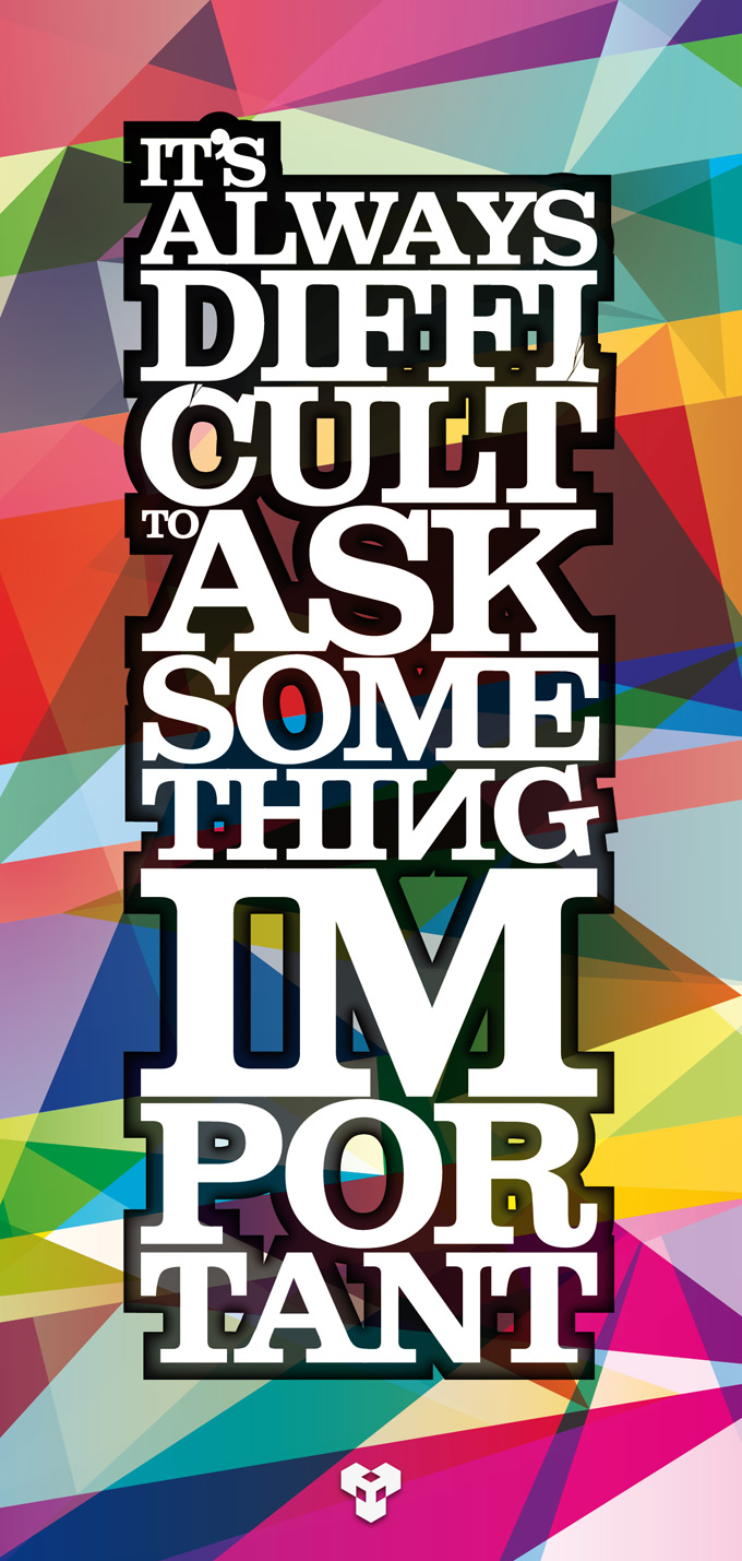
The idea was simple, working with the main shape : the triangle. At the start it was used to make the background of a simple flyer called "It's always difficult to ask something important". The concept was easy to workout so I tried to take this to an other level: make the portrait of a friend (the FAITH illustration). For once I was happy to use a big range of colours; I used to stay on basic colours, or even no colour at all. It takes a lot of time to build something from a superposition of triangles.
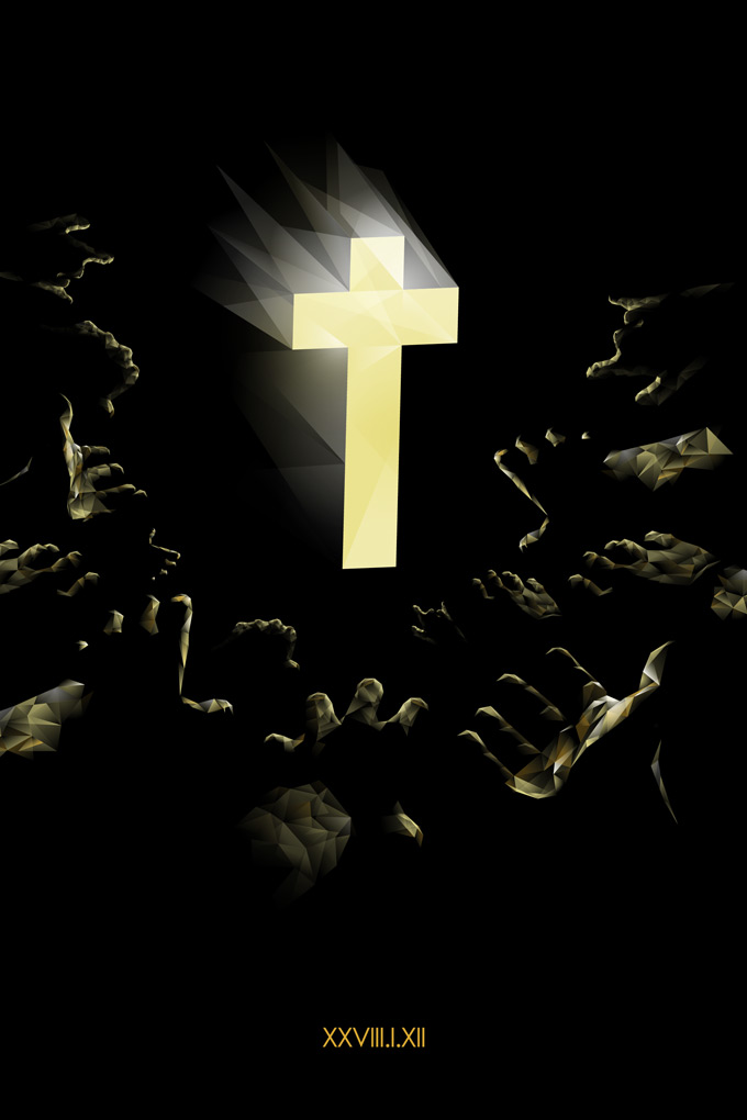
The 'Justice' illustration is monochrome (go back to the basics) and about my favourite band. Something simple, the color of the band and the atmosphere of their live performance
‘‘Easy and colorfull, I love triangles.’’
permalink
14 September 2011
Since the poster of Sponge Bob, I wanted to continue on this idea but with something else; make posters of classical movies was the best thing to do. For each poster you have to know what object is iconic with the movie. And keeping a soviet style, a way between Shepard Fairey and USSR propaganda.

2001 A Space Odyssey
by Stanley Kubrick
1968

Orange Clockwork
by Stanley Kubrick
1971

Orange Clockwork
by Stanley Kubrick
1971

Shining
by Stanley Kubrick
1980

Taxi Driver
by Martin Scorsese
1976

Taxi Driver
by Martin Scorsese
1976

Taxi Driver
by Martin Scorsese
1976
‘‘Graphists from this period are geniuses.’’
permalink
and my addiction to RSS feeds
01 August 2011
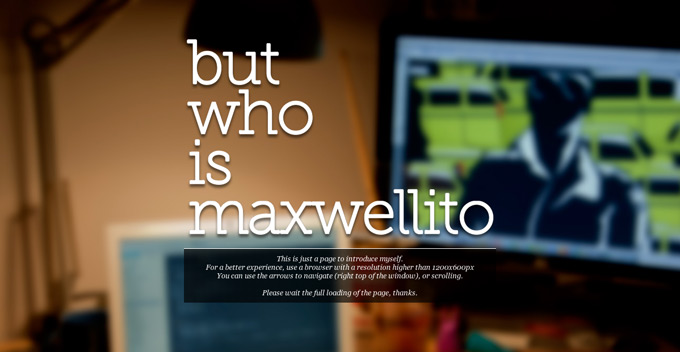
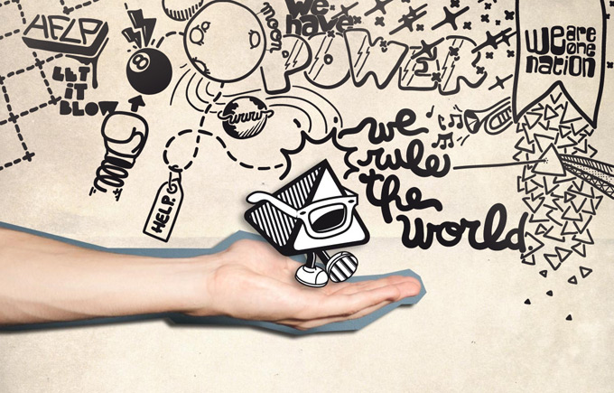
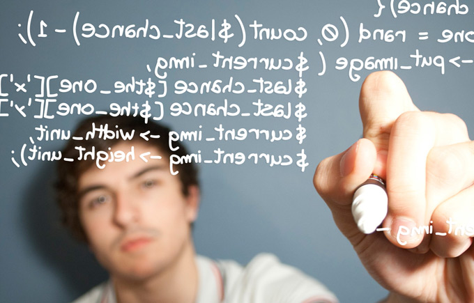
Before to move to London, I needed something to introduce my-self to recruitors (something better than a simple CV). A simple webpage was the most appropriate solution, something as weird as me. There is different points on this page: my dev skills, my geeky side, my pseudo creative side, my hobby for design and my curiosity.
It took me a lot of time to make these designs and illustrate my ideas. And everything works with HTML and CSS, the JavaScript is optional.
The 'aboutMe' page is available here
‘‘This is the most narcissic thing I've ever done.’’
permalink
